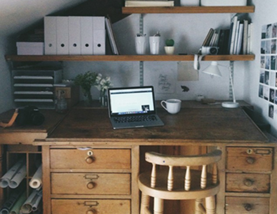
With only a handful of settings at your disposal, composition is possibly the single most important part of smartphone photography. If you've ever wondered why the pictures on your screen never quite look as good as they did to your eyes, then the list below should help.
As with all rules, there are exceptions, and times when ignoring them completely brings the most beautiful results of all. Use the tips below as a guide, and have fun playing outside the rulebook too.
Consider your lens placement
When composing with your smartphone, there's one key thing to keep in mind where the camera lens is placed. On an iPhone, this is the top left corner meaning, when you're lining up dead-centre with a subject, your phone should be held slightly to the left.

Straight Lines
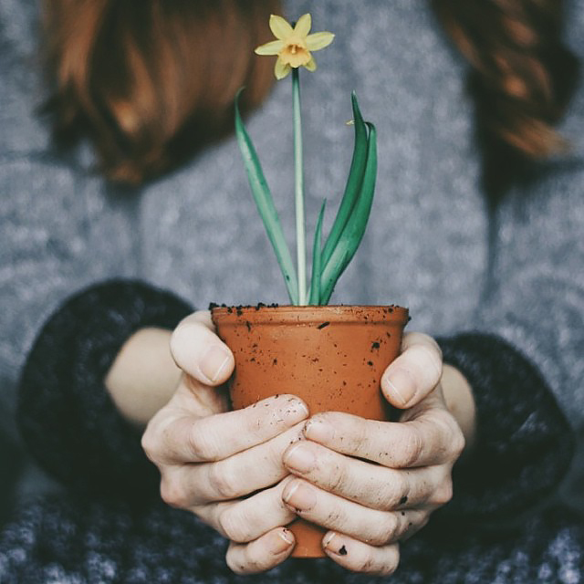
Look for the straight horizontal or vertical lines in your composition, and keep them straight. You can turn on grid lines to help guide you under settings > camera > grid.
Symmetry
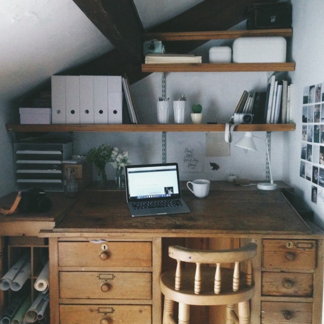
If your subject has striking symmetry, showcase this by getting your camera exactly centre, to ensure the perspective is the same for both sides. Use the guide grid to ensure you're centred accurately.

Negative space
This is the empty space around your subject framing it and giving it wider context. Many of my favourite shots are the last ones I snap after I've stepped away, thinking I'm done the added distance giving extra perspective and negative space. Keep in mind that this space doesn't have to be plain white negative space doesn't have to be empty, but rather be a simple place for the eyes to rest.
Rule of thirds
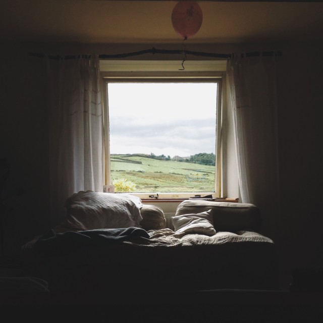
Sounds fancy, but it simply means this: imagine three evenly spaced lines dividing your photo horizontally and vertically. Where these lines meet create points that are supposedly most pleasing to the eye. Lining stuff up the person against the landscape, the flower against the greenery with where these lines intersect, and using them to arrange your horizontal or vertical planes is somehow more visually pleasing to humans. Cats have yet to inform us of their preferences, but they probably think so too.


Off center
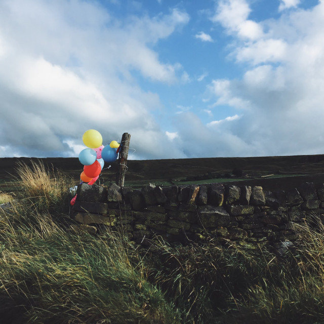
If that's all a bit too calculated, just remember this: sometimes it's nice to have your subject a bit off centre. If there's a person looking in one direction, leave the bigger space on the side they are facing.
Don't just stand there
Get down on the same level as your subject. Lean over the tabletop. Hang off the fence with one arm so you can get your camera right in amongst the sheep. Yes, you'll look a little strange, but you'll also get the killer shot. Great photography is a physical and active process.
A little bit of a mess
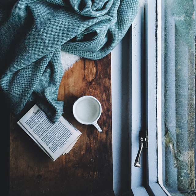
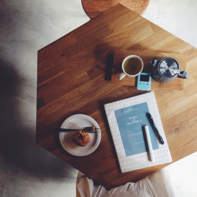
For all the above, I'm a big advocate of letting a photo be a little bit unbalanced and messy. Symmetrical, but with one thing off balance; pretty styling, with an added element of mess. Perfection is eye-catching and striking, but it's the little imperfections that really hold people's attention, and tells much more of the story


Ready to showcase your photo skills? Create a premium quality photo album with Inkifi today.
