
Welcome to the first part in this series of iPhoneography tips, where I'm going to show you how to apply well-established photography principles to elevate your mobile photography. Over the series, we'll be tackling everything from different types of compositional techniques to lighting and inspiration for what to shoot. Just because you shot it on your mobile phone doesn't have to mean that your image will be a throwaway snapshot. With the quality our phones record these days, you can get away with making even the most striking prints, so why not treat your phone with the same respect as you would your "proper" camera.
THE RULE OF THIRDS
In this first part, we're talking about one of the most fundamental composition principles, the Rule of Thirds. I'm pretty sure you will recognise this term, especially if you like photographing landscapes, but often this principle is very underutilised when it comes to applying it to a wider variety of subject matters. So, I'm going to run through a few different ways the Rule of Thirds can help you take more balanced images that will be naturally pleasing to the human eye.
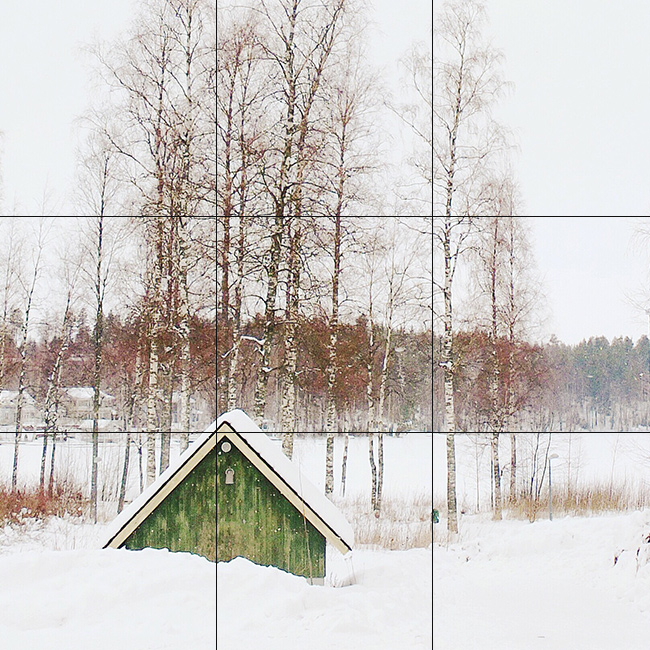
The main principle of the Rule of Thirds is pretty straightforward. First and foremost, you'll have to imagine your image divided into nine equal parts. It doesn't matter whether you're shooting in portrait orientation or even straight into a square like I tend to, either way, you can always divide the image in your mind into nine parts, with two horizontal and two vertical lines running through it and intersecting at four crucial points.
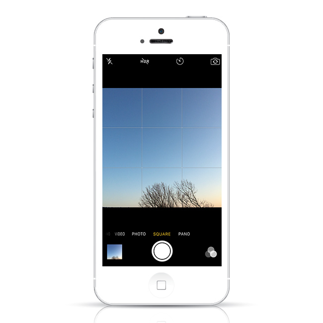
If you want a bit of assistance with this, you can actually have your iPhone display gridlines for you. All you need to do is to go to your Settings, locate the Photos & Camera menu and turn on Grid.
So, that's the simple part. Lets dig into how you can use these magical lines to your advantage.
FOCAL POINT
A strong image should generally have a main focal point, such as a person, a building, the sun, or anything else that could be the hero in your shot. In order for the viewers eye to instantly recognise your intended focal point, place it on one of the four intersections of your lines.
This compositional technique has been tried, tested and proven successful throughout the times, from the great master painters all the way to modern-day artists working in many different mediums and styles. There seems to just something very balanced, dynamic, and pleasing to the eye about placing your main subject at these four points in your image.
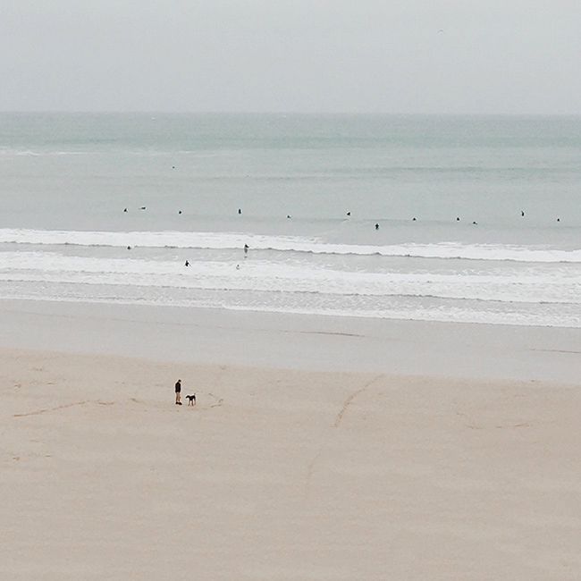
Even though there's visually quite a lot of space, as well as many disparate objects in the image above, your eye is instantly drawn to the man with his dog as it's placed as the focal point at the lower left intersection. In this way, the Rule of Thirds can be used to bring clarity to an otherwise random scene.
LANDSCAPES
The Rule of Thirds is most commonly utilised when shooting landscapes. It is thought that keeping the principle in mind will help you to get a more eye-pleasing composition that pulls the viewer into the scene. When you place the horizon on one of the horizontal lines, it will help the areas in your image feel more balanced than having the horizon in the middle of the image would.
Which line you place the horizon on depends on what you want the viewer's eye to concentrate on. If you have a beautiful landscape in front of you, or perhaps the ocean, which you want to be the main focal point, place the horizon on the top horizontal line. If you want to accentuate the sky because there are beautiful clouds or perhaps a sunset to concentrate on, place the horizon on the lower horizontal line.
There's also an added benefit for keeping the horizontal lines in mind when you shoot, as it will help you remember to keep your images straight as well. A wonky horizon is the easiest way to lose impact in a landscape photo.

In the image above, the horizon follows the top line, while the main landmass is approximately on the lower right intersection, which makes a potentially tricky landscape sit comfortably within the image.
Portraits
If you are photographing a portrait of a person, a good way to utilise the Rule of Thirds would be to position the face of your subject in one of the top intersections. It's also thought that having their body follow one of the vertical lines, as opposed to having your subject in the dead centre, will add a pleasing tension to the composition.
If you're taking a tighter portrait of just the face, it will have more impact if both eyes line up on the top horizontal line, and at last one eye is positioned on one of the top intersections.
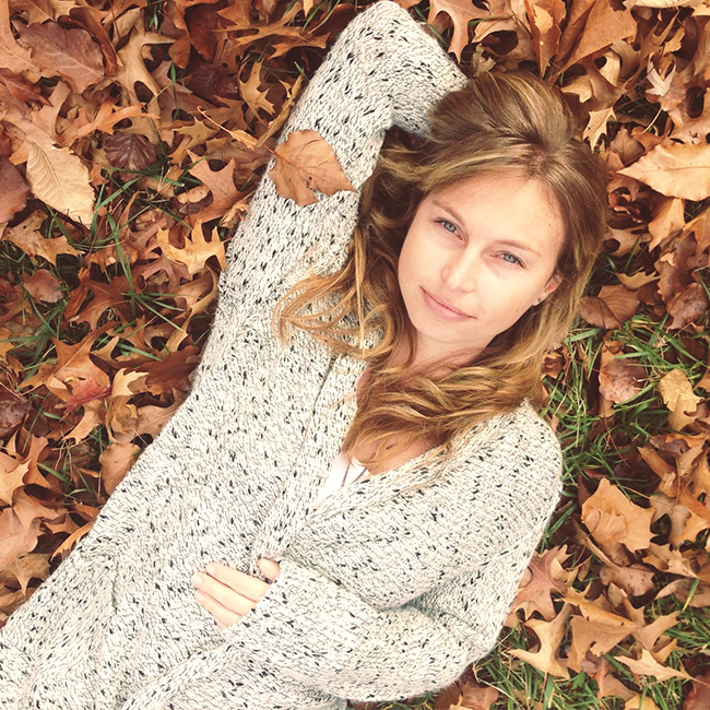
Even if you take your portrait from an unusual angle like above, placing the eyes in the upper intersection helps to ground the composition and guide the viewer's eye.
Negative Space
Negative space is a great way to add instant impact to your image. However, if done wrong, negative space can look more like a mistake, a little bit like composition gone haywire.
Utilising the Rule of Thirds when taking a picture with negative space will most always give you a pleasing result. Just pop your main subject on one of the intersections, and make sure your background is simple and distraction-free, and you have almost guaranteed dynamic composition that will make your subject matter pop.

Sometimes this simple method can really elevate even the most mundane of images. If the image above was just a straight-on shot of some feet, it would feel much more like a snapshot, but including the element of negative space in the form of the water adds much-needed tension to the composition.
DIRECTION OF MOVEMENT
As well as negative space, you can use the Rule of Thirds to leave dynamic space for your subject to either move towards, or look into. For example, if you place your subject on one of the intersections on the left, making sure their movement or gaze is directed towards the right, the eye will naturally follow their movement or gaze in the image to see where they are heading.
This works especially well when photographing people doing sports, or even something like a bird in mid-flight. Leaving space in your composition for things like trains or cars to move into will also help to create more interesting images of everyday movement.
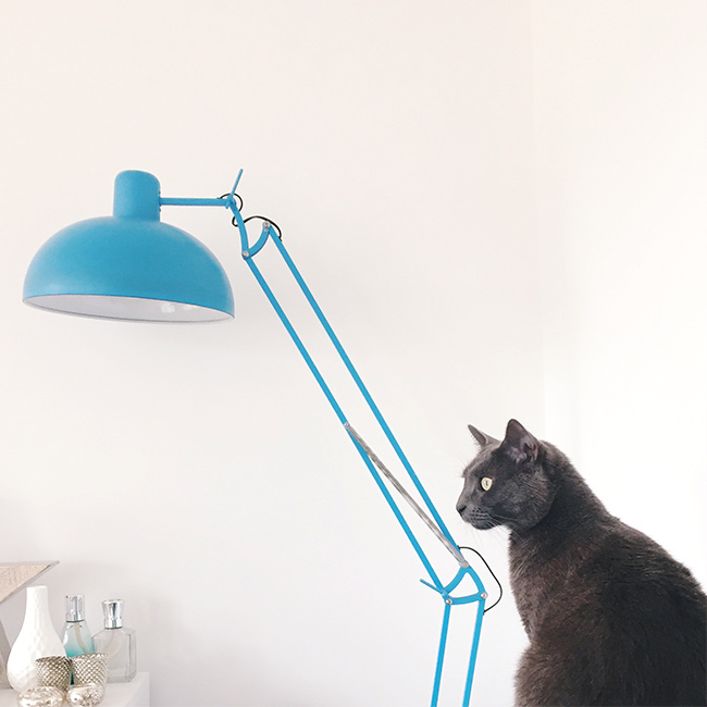
My other cat, Sofia, is not really known for her movement, so she's demonstrating this point with her gaze. To make this image work even better it would make sense to flip it, as the eye usually wants to travel from left to right.
(P.S. I was going to suggest that this whole series was about cat images, but then thought that would probably not fly, so I'll just sneakily infiltrate my cats into it when I can.)
SYMMETRY
I love a bit of symmetry, and we'll definitely talk more about using it as a compositional tool later. When shooting a symmetrical image, using the landscape method of placing your horizon on one of the horizontal lines helps to create a balanced image, it's especially effective if you're shooting a symmetrical reflection on a mirrored surface such as water.
However, you can add even more interest to asymmetrical image like this by incorporating an element that breaks the symmetry and adds a different focal point, by placing something in one of the intersections. This could be something like a plant in the foreground or a bird in the background. Breaking symmetry also works well when you just can't get into a position where you could achieve a perfectly symmetrical angle.
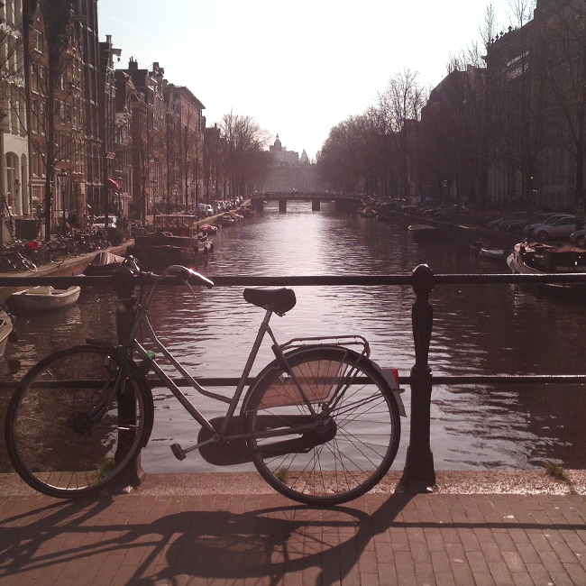
I have shot many perfectly symmetrical canal shots in Amsterdam, but there's just something a lot more dynamic about a photo when you add a focal point to break up the scene.
CLOSE-UPS
Often when taking close-up images, say, of flowers, food, jewellery, or perhaps even just surface textures, the temptation is to go completely symmetrical and compose a perfectly centralised image (it's definitely something I find really hard to resist!). The trouble is, a full composition like this can soon turn into a bit of a mess. Unless the texture or colour itself is so striking that it stops the viewer in their tracks, there might be nothing to specifically catch the eye, and the images might end up feeling more like a background pattern rather than a work of art.
Unless the texture or colour itself is so striking that it stops the viewer in their tracks, without a clear focal point there might be nothing to specifically catch the eye, and the image might end up feeling more like a background pattern rather than a work of art.
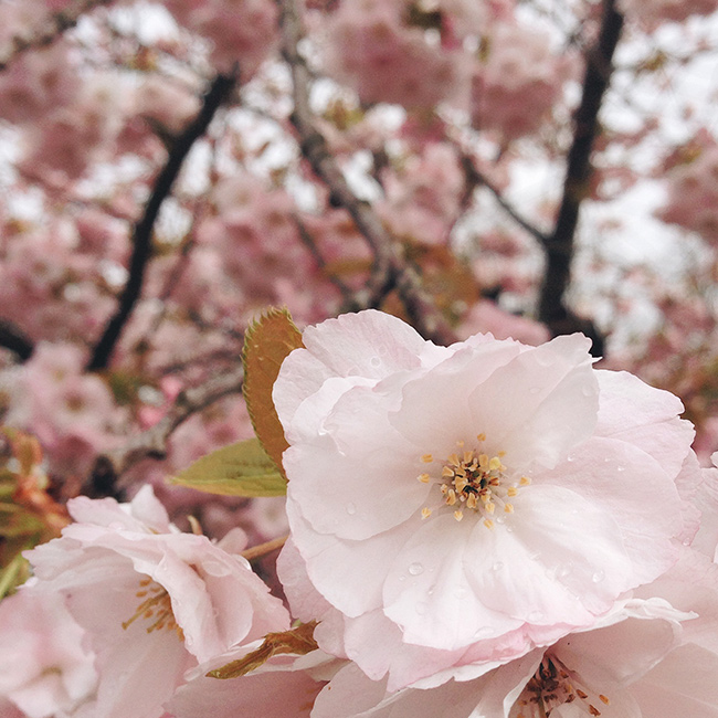
To shake things up, try the Rule of Thirds here, too, and place the most interesting element of your close-up, perhaps a water droplet, or as in the image above, the centre of the flower, on one of the intersections in order to create a much more compelling close-up image.
Flat LaysThese days, taking Flat Lay still-lifes is one of the most popular approaches to iPhoneography. You can find many, many examples of this on Instagram. If you struggle to make your Flat Lays look balanced, the Rule of Thirds will come to your rescue here as well. Simply place different items along the horizontal and vertical lines, making sure that one of the intersections has your main object. Featured product; Square Photo Prints.
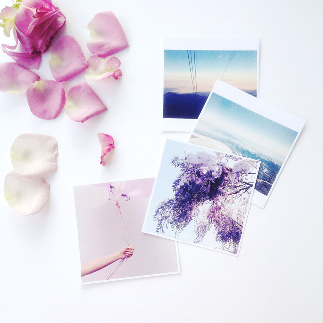
Remember, you don't have to fill all the intersections, you can still have a scattered approach if you don't want that full-on organised look, but having your focal point at one of the intersections, like above, makes it much easier for the eye to take in the whole scene.
Knowing what generally works best for an image doesn't mean you can't break the rules when you feel like it, but you do have to know the rules in order to break them. I hope some of these examples will give you new ideas about how keeping the Rule of Thirds in mind could elevate your mobile images from throwaways to keepers. I hope you'll have fun experimenting with applying the principle to a variety of different subjects, even to abstract images!
